
How do you refresh an iconic & beloved brand? Who Gives A Crap was in need of a visual zhuzh-up that pushed the brand forward but didn’t let go of all the equity it had built up over the years as a quirky & lovable underdog startup.
#brandidentity
#design
#packaging
#design
#packaging
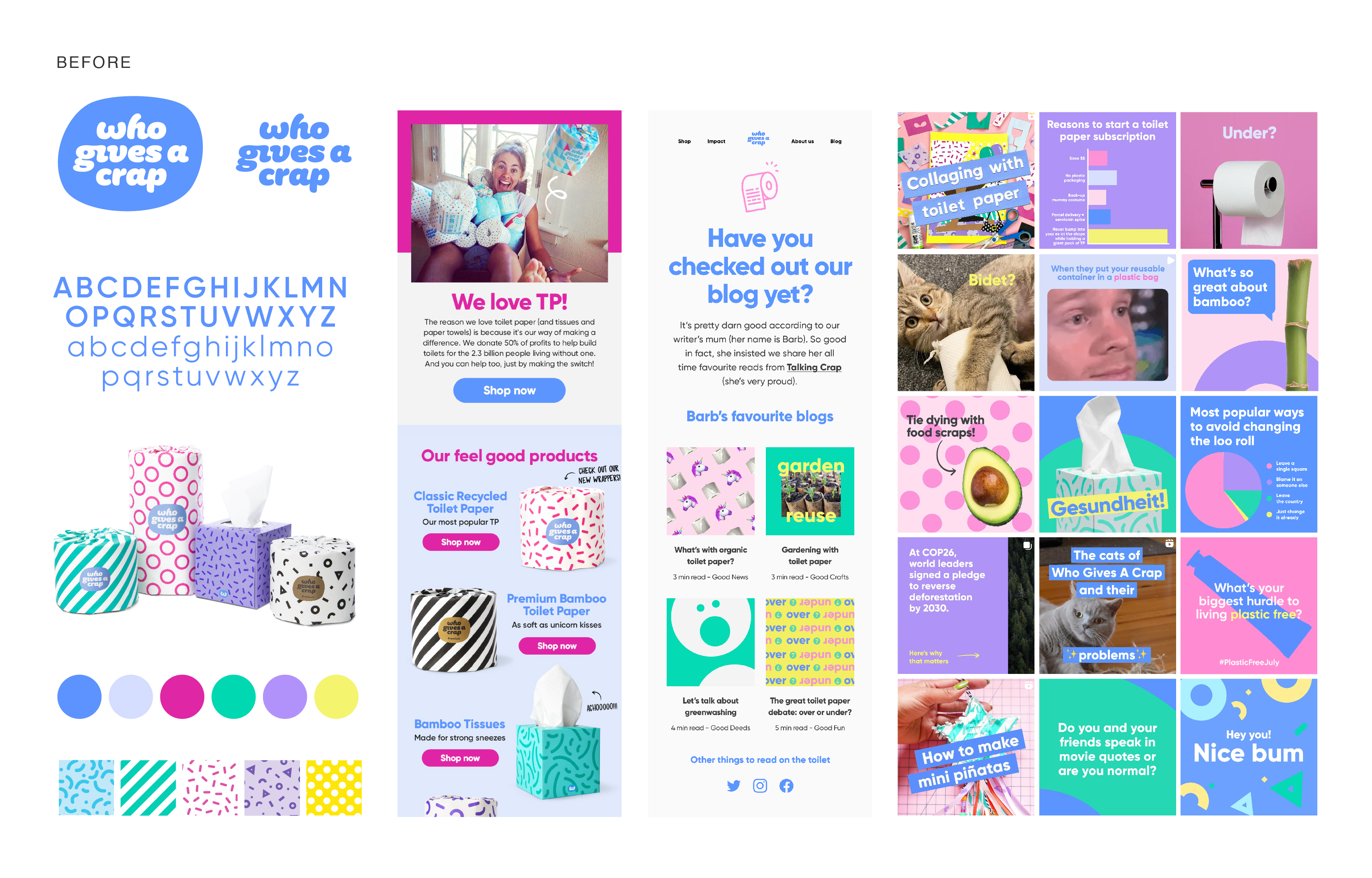
(before) The brand has a reputation for making everyday household items fun and delightful with colourful packaging and playful puns. It’s a brand that breaks away from the expected eco look of monotonous earth tones, uses “bum” freely and doesn’t shy away from a dad joke.
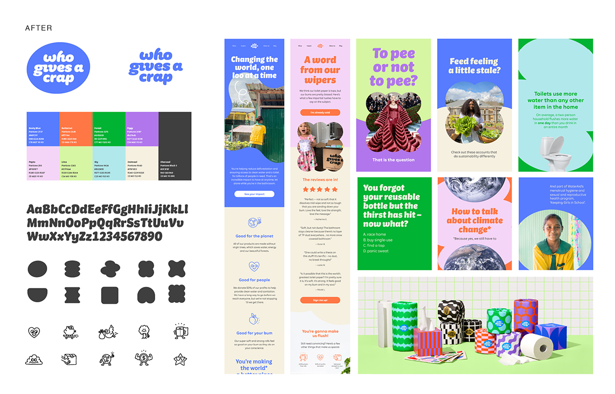
(after) The goal behind the brand evolution was to design an ownable visual and packaging system that took what was great about the brand and distilled it into a toolkit that was user-friendly, flexible and fun—but with enough guardrails to keep it focused and ownable.
Instead of having one brand color, we leaned even harder into the the colorful nature of the brand and created a vibrant palette of unexpected combinations.

We worked with Colophon Foundry to develop a custom font inspired by our logo and gave our cheeky copy more of a visual “voice.” We also added a unique icon set to the toolkit to help explain our USPs and product features.![]()


When it came to packaging, Who Gives A Crap already had a lot of brand recognition, and we wanted to make sure we honored that. We kept the playful patterns that made it so iconic but updated them with a bolder, more geometric approach. Each product was designed to be exciting on its own while also working well as a set.
![]()
![]()
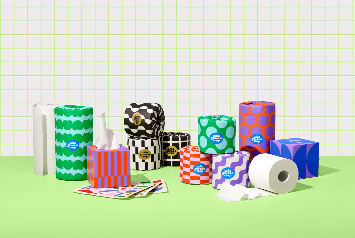
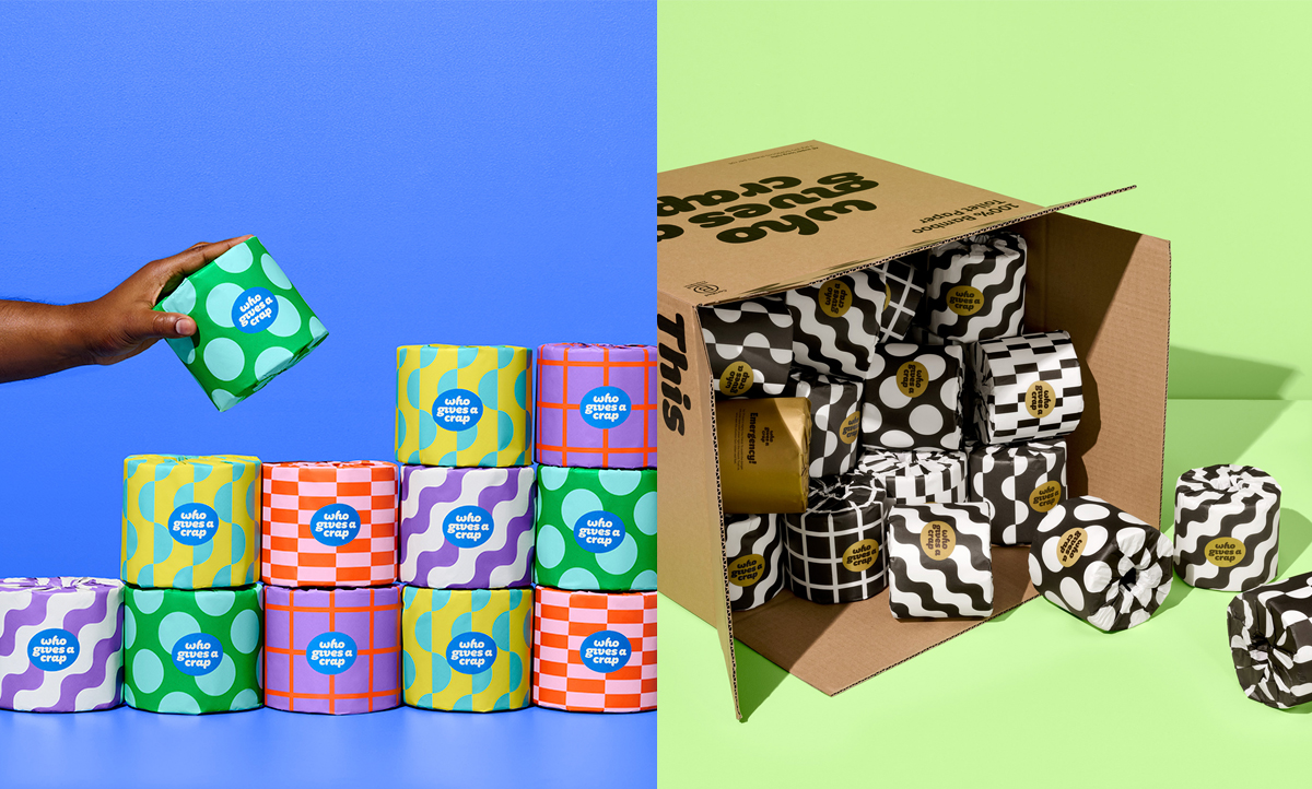
The finished result is a fun and playful brand with vibrant packaging that invites our customers to feel great about doing good.
The finished result is a fun and playful brand with vibrant packaging that invites our customers to feel great about doing good.